# CSS3 常见动画
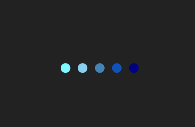
# 交错动画
点击查看代码
<div class="loading">
  <div class="dot"></div>
  <div class="dot"></div>
  <div class="dot"></div>
  <div class="dot"></div>
  <div class="dot"></div>
</div>
<style>
body {
  display: flex;
  height: 100vh;
  justify-content: center;
  align-items: center;
  background: #222;
}

.loading {
  $colors: #7ef9ff, #89cff0, #4682b4, #0f52ba, #000080;
  display: flex;
  animation-delay: 1s;

  .dot {
    position: relative;
    width: 2em;
    height: 2em;
    margin: 0.8em;
    border-radius: 50%;

    &::before {
      position: absolute;
      content: "";
      width: 100%;
      height: 100%;
      background: inherit;
      border-radius: inherit;
      animation: wave 2s ease-out infinite;
    }

    @for $i from 1 through 5 {
      &:nth-child(#{$i}) {
        background: nth($colors, $i);

        &::before {
          animation-delay: $i * 0.2s;
        }
      }
    }
  }
}

@keyframes wave {
  50%,
  75% {
    transform: scale(2.5);
  }

  80%,
  100% {
    opacity: 0;
  }
}

</style>
1
2
3
4
5
6
7
8
9
10
11
12
13
14
15
16
17
18
19
20
21
22
23
24
25
26
27
28
29
30
31
32
33
34
35
36
37
38
39
40
41
42
43
44
45
46
47
48
49
50
51
52
53
54
55
56
57
58
59
60
61
62
63
2
3
4
5
6
7
8
9
10
11
12
13
14
15
16
17
18
19
20
21
22
23
24
25
26
27
28
29
30
31
32
33
34
35
36
37
38
39
40
41
42
43
44
45
46
47
48
49
50
51
52
53
54
55
56
57
58
59
60
61
62
63
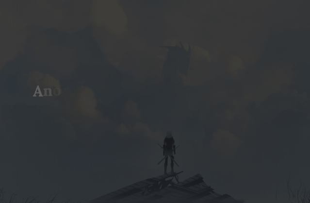
# 用JS分割文本
点击查看代码
<p class="landIn">Ano hi watashitachi mada shiranai no Fushigi no monogatari desu.</p>

<style>
  @import url("https://fonts.googleapis.com/css?family=Lora:400,400i,700");

body {
  display: flex;
  flex-direction: column;
  height: 100vh;
  justify-content: center;
  align-items: center;
  background-image: linear-gradient(rgba(16, 16, 16, 0.8),
      rgba(16, 16, 16, 0.8)),
    url(https://i.loli.net/2019/10/18/buDT4YS6zUMfHst.jpg);
  background-size: cover;
}

p {
  margin: 0 9em;
  font-size: 2em;
  font-weight: 600;
}

.landIn {
  display: flex;
  flex-wrap: wrap;
  line-height: 1.8;
  color: white;
  font-family: Lora, serif;
  white-space: pre;

  span {
    animation: landIn 0.8s ease-out both;
  }
}

@keyframes landIn {
  from {
    opacity: 0;
    transform: translateY(-20%);
  }

  to {
    opacity: 1;
    transform: translateY(0);
  }
}
</style>
<script>
  let landInTexts = document.querySelectorAll(".landIn");
  landInTexts.forEach(landInText => {
    let letters = landInText.textContent.split("");
    landInText.textContent = "";
    letters.forEach((letter, i) => {
      let span = document.createElement("span");
      span.textContent = letter;
      span.style.animationDelay = `${i * 0.05}s`;
      landInText.append(span);
    });
  });

</script>
1
2
3
4
5
6
7
8
9
10
11
12
13
14
15
16
17
18
19
20
21
22
23
24
25
26
27
28
29
30
31
32
33
34
35
36
37
38
39
40
41
42
43
44
45
46
47
48
49
50
51
52
53
54
55
56
57
58
59
60
61
62
2
3
4
5
6
7
8
9
10
11
12
13
14
15
16
17
18
19
20
21
22
23
24
25
26
27
28
29
30
31
32
33
34
35
36
37
38
39
40
41
42
43
44
45
46
47
48
49
50
51
52
53
54
55
56
57
58
59
60
61
62
# 用JS分割文本2

点击查看代码
<div class="reveal">sword art online</div>

<style>
  @import url("https://fonts.googleapis.com/css?family=Raleway:400,400i,700");

body {
  display: flex;
  height: 100vh;
  justify-content: center;
  align-items: center;
  text-align: center;
  background: #222;
}

.reveal {
  position: relative;
  display: flex;
  color: #6ee1f5;
  font-size: 2em;
  font-family: Raleway, sans-serif;
  letter-spacing: 3px;
  text-transform: uppercase;
  white-space: pre;

  span {
    opacity: 0;
    transform: scale(0);
    animation: fadeIn 2.4s forwards;
  }

  &::before,
  &::after {
    position: absolute;
    content: "";
    top: 0;
    bottom: 0;
    width: 2px;
    height: 100%;
    background: white;
    opacity: 0;
    transform: scale(0);
  }

  &::before {
    left: 50%;
    animation: slideLeft 1.5s cubic-bezier(0.7, -0.6, 0.3, 1.5) forwards;
  }

  &::after {
    right: 50%;
    animation: slideRight 1.5s cubic-bezier(0.7, -0.6, 0.3, 1.5) forwards;
  }
}

@keyframes fadeIn {
  to {
    opacity: 1;
    transform: scale(1);
  }
}

@keyframes slideLeft {
  to {
    left: -6%;
    opacity: 1;
    transform: scale(0.9);
  }
}

@keyframes slideRight {
  to {
    right: -6%;
    opacity: 1;
    transform: scale(0.9);
  }
}

</style>

<script>
  let duration = 0.8;
let delay = 0.3;
let revealText = document.querySelector(".reveal");
let letters = revealText.textContent.split("");
revealText.textContent = "";
let middle = letters.filter(e => e !== " ").length / 2;
letters.forEach((letter, i) => {
  let span = document.createElement("span");
  span.textContent = letter;
  span.style.animationDelay = `${delay + Math.abs(i - middle) * 0.1}s`;
  revealText.append(span);
});

  </script>
1
2
3
4
5
6
7
8
9
10
11
12
13
14
15
16
17
18
19
20
21
22
23
24
25
26
27
28
29
30
31
32
33
34
35
36
37
38
39
40
41
42
43
44
45
46
47
48
49
50
51
52
53
54
55
56
57
58
59
60
61
62
63
64
65
66
67
68
69
70
71
72
73
74
75
76
77
78
79
80
81
82
83
84
85
86
87
88
89
90
91
92
93
94
2
3
4
5
6
7
8
9
10
11
12
13
14
15
16
17
18
19
20
21
22
23
24
25
26
27
28
29
30
31
32
33
34
35
36
37
38
39
40
41
42
43
44
45
46
47
48
49
50
51
52
53
54
55
56
57
58
59
60
61
62
63
64
65
66
67
68
69
70
71
72
73
74
75
76
77
78
79
80
81
82
83
84
85
86
87
88
89
90
91
92
93
94
# 随机粒子动画
点击查看代码
<div class="snow"></div> 多次循环该元素

<style>
body {
  height: 100vh;
  background: radial-gradient(ellipse at bottom, #1b2735 0%, #090a0f 100%);
  overflow: hidden;
  filter: drop-shadow(0 0 10px white);
}

@function random_range($min, $max) {
  $rand: random();
  $random_range: $min + floor($rand * (($max - $min) + 1));
  @return $random_range;
}

.snow {
  $total: 200;
  position: absolute;
  width: 10px;
  height: 10px;
  background: white;
  border-radius: 50%;

  @for $i from 1 through $total {
    $random-x: random(1000000) * 0.0001vw;
    $random-offset: random_range(-100000, 100000) * 0.0001vw;
    $random-x-end: $random-x + $random-offset;
    $random-x-end-yoyo: $random-x + ($random-offset / 2);
    $random-yoyo-time: random_range(30000, 80000) / 100000;
    $random-yoyo-y: $random-yoyo-time * 100vh;
    $random-scale: random(10000) * 0.0001;
    $fall-duration: random_range(10, 30) * 1s;
    $fall-delay: random(30) * -1s;

    &:nth-child(#{$i}) {
      opacity: random(10000) * 0.0001;
      transform: translate($random-x, -10px) scale($random-scale);
      animation: fall-#{$i} $fall-duration $fall-delay linear infinite;
    }

    @keyframes fall-#{$i} {
      #{percentage($random-yoyo-time)} {
        transform: translate($random-x-end, $random-yoyo-y) scale($random-scale);
      }

      to {
        transform: translate($random-x-end-yoyo, 100vh) scale($random-scale);
      }
    }
  }
}
</style>
1
2
3
4
5
6
7
8
9
10
11
12
13
14
15
16
17
18
19
20
21
22
23
24
25
26
27
28
29
30
31
32
33
34
35
36
37
38
39
40
41
42
43
44
45
46
47
48
49
50
51
52
53
54
2
3
4
5
6
7
8
9
10
11
12
13
14
15
16
17
18
19
20
21
22
23
24
25
26
27
28
29
30
31
32
33
34
35
36
37
38
39
40
41
42
43
44
45
46
47
48
49
50
51
52
53
54
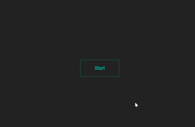
# 伪类和伪元素实现动画边框
点击查看代码
<button
  data-text="Start"
  class="btn btn-primary btn-ghost btn-border-stroke  btn-text-float-up"
>
  <div class="btn-borders">
    <div class="border-top"></div>
    <div class="border-right"></div>
    <div class="border-bottom"></div>
    <div class="border-left"></div>
  </div>
  <span class="btn-text">Start</span>
</button>

<style>
  @import url(https://fonts.googleapis.com/css?family=Lato);

body {
  display: flex;
  height: 100vh;
  justify-content: center;
  align-items: center;
  text-align: center;
  background: #1A1E23;
}

.btn {
  --hue: 190;
  --ease-in-duration: 0.25s;
  --ease-in-exponential: cubic-bezier(0.95, 0.05, 0.795, 0.035);
  --ease-out-duration: 0.65s;
  --ease-out-delay: var(--ease-in-duration);
  --ease-out-exponential: cubic-bezier(0.19, 1, 0.22, 1);
  position: relative;
  padding: 1rem 3rem;
  font-size: 1rem;
  line-height: 1.5;
  color: white;
  text-decoration: none;
  background-color: hsl(var(--hue), 100%, 41%);
  border: 1px solid hsl(var(--hue), 100%, 41%);
  outline: transparent;
  overflow: hidden;
  cursor: pointer;
  user-select: none;
  white-space: nowrap;
  transition: 0.25s;

  &:hover {
    background: hsl(var(--hue), 100%, 31%);
  }

  &-primary {
    --hue: 171;
  }

  &-ghost {
    color: hsl(var(--hue), 100%, 41%);
    background-color: transparent;
    border-color: hsl(var(--hue), 100%, 41%);

    &:hover {
      color: white;
    }
  }

  &-border-stroke {
    border-color: hsla(var(--hue), 100%, 41%, 0.35);

    .btn-borders {
      position: absolute;
      top: 0;
      left: 0;
      width: 100%;
      height: 100%;

      .border-top {
        position: absolute;
        top: 0;
        width: 100%;
        height: 1px;
        background: hsl(var(--hue), 100%, 41%);
        transform: scaleX(0);
        transform-origin: left;
      }

      .border-right {
        position: absolute;
        right: 0;
        width: 1px;
        height: 100%;
        background: hsl(var(--hue), 100%, 41%);
        transform: scaleY(0);
        transform-origin: bottom;
      }

      .border-bottom {
        position: absolute;
        bottom: 0;
        width: 100%;
        height: 1px;
        background: hsl(var(--hue), 100%, 41%);
        transform: scaleX(0);
        transform-origin: left;
      }

      .border-left {
        position: absolute;
        left: 0;
        width: 1px;
        height: 100%;
        background: hsl(var(--hue), 100%, 41%);
        transform: scaleY(0);
        transform-origin: bottom;
      }

      // when unhover, ease-out left, bottom; ease-in right, top

      .border-left {
        transition: var(--ease-out-duration) var(--ease-out-delay)
          var(--ease-out-exponential);
      }
      .border-bottom {
        transition: var(--ease-out-duration) var(--ease-out-delay)
          var(--ease-out-exponential);
      }

      .border-right {
        transition: var(--ease-in-duration) var(--ease-in-exponential);
      }
      .border-top {
        transition: var(--ease-in-duration) var(--ease-in-exponential);
      }
    }

    &:hover {
      color: hsl(var(--hue), 100%, 41%);
      background: transparent;

      .border-top,
      .border-bottom {
        transform: scaleX(1);
      }
      .border-left,
      .border-right {
        transform: scaleY(1);
      }

      // when hover, ease-in left, bottom; ease-out right, top

      .border-left {
        transition: var(--ease-in-duration) var(--ease-in-exponential);
      }
      .border-bottom {
        transition: var(--ease-in-duration) var(--ease-in-exponential);
      }

      .border-right {
        transition: var(--ease-out-duration) var(--ease-out-delay)
          var(--ease-out-exponential);
      }
      .border-top {
        transition: var(--ease-out-duration) var(--ease-out-delay)
          var(--ease-out-exponential);
      }
    }
  }

  &-text-float-up {
    &::after {
      position: absolute;
      content: attr(data-text);
      top: 0;
      left: 0;
      width: 100%;
      height: 100%;
      display: flex;
      justify-content: center;
      align-items: center;
      opacity: 0;
      transform: translateY(35%);
      transition: 0.25s ease-out;
    }

    // when hover, ease-in top-text; ease-out bottom-text

    .btn-text {
      display: block;
      transition: 0.75s 0.1s var(--ease-out-exponential);
    }

    &:hover {
      // when hover, ease-in bottom-text; ease-out top-text

      .btn-text {
        opacity: 0;
        transform: translateY(-25%);
        transition: 0.25s ease-out;
      }

      &::after {
        opacity: 1;
        transform: translateY(0);
        transition: 0.75s 0.1s var(--ease-out-exponential);
      }
    }
  }
}

  </style>
1
2
3
4
5
6
7
8
9
10
11
12
13
14
15
16
17
18
19
20
21
22
23
24
25
26
27
28
29
30
31
32
33
34
35
36
37
38
39
40
41
42
43
44
45
46
47
48
49
50
51
52
53
54
55
56
57
58
59
60
61
62
63
64
65
66
67
68
69
70
71
72
73
74
75
76
77
78
79
80
81
82
83
84
85
86
87
88
89
90
91
92
93
94
95
96
97
98
99
100
101
102
103
104
105
106
107
108
109
110
111
112
113
114
115
116
117
118
119
120
121
122
123
124
125
126
127
128
129
130
131
132
133
134
135
136
137
138
139
140
141
142
143
144
145
146
147
148
149
150
151
152
153
154
155
156
157
158
159
160
161
162
163
164
165
166
167
168
169
170
171
172
173
174
175
176
177
178
179
180
181
182
183
184
185
186
187
188
189
190
191
192
193
194
195
196
197
198
199
200
201
202
203
204
205
206
207
208
209
210
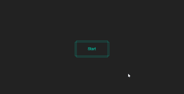
# 绝对定位实现多重边框342
点击查看代码
<button class="btn btn-primary btn-ghost btn-multiple-border-stroke">
  <div class="btn-borders-group">
    <div class="border-top"></div>
    <div class="border-right"></div>
    <div class="border-bottom"></div>
    <div class="border-left"></div>
  </div>
  <div class="btn-borders-group">
    <div class="border-top"></div>
    <div class="border-right"></div>
    <div class="border-bottom"></div>
    <div class="border-left"></div>
  </div>
  <div class="btn-borders-group">
    <div class="border-top"></div>
    <div class="border-right"></div>
    <div class="border-bottom"></div>
    <div class="border-left"></div>
  </div>
  <span class="btn-text">Start</span>
</button>


<style>
  @import url(https://fonts.googleapis.com/css?family=Lato);

body {
  display: flex;
  height: 100vh;
  justify-content: center;
  align-items: center;
  text-align: center;
  background: #1A1E23;
}

.btn {
  --hue: 190;
  --ease-in-duration: 0.25s;
  --ease-out-duration: 0.65s;
  --ease-out-delay: var(--ease-in-duration);
  position: relative;
  padding: 1rem 3rem;
  font-size: 1rem;
  line-height: 1.5;
  color: white;
  text-decoration: none;
  background-color: hsl(var(--hue), 100%, 41%);
  border: 1px solid hsl(var(--hue), 100%, 41%);
  outline: transparent;
  cursor: pointer;
  user-select: none;
  white-space: nowrap;
  transition: 0.25s;

  &:hover {
    background: hsl(var(--hue), 100%, 31%);
  }

  &-primary {
    --hue: 171;
  }

  &-ghost {
    color: hsl(var(--hue), 100%, 41%);
    background-color: transparent;
    border-color: hsl(var(--hue), 100%, 41%);

    &:hover {
      color: white;
    }
  }

  &-multiple-border-stroke {
    border-color: transparent;

    .btn-borders-group {
      position: absolute;
      top: 0;
      left: 0;
      display: flex;
      justify-content: center;
      align-items: center;
      width: 100%;
      height: 100%;
      border: 1px solid hsla(var(--hue), 100%, 41%, 0.35);

      &:nth-child(1) {
        left: -8px;
        padding: 0 8px;
      }

      &:nth-child(2) {
        top: -8px;
        padding: 8px 0;
      }

      &:nth-child(3) {
        top: -4px;
        left: -4px;
        padding: 4px;
      }

      .border-top {
        position: absolute;
        top: 0;
        width: 100%;
        height: 1px;
        background: hsl(var(--hue), 100%, 41%);
        transform: scaleX(0);
        transform-origin: left;
      }

      .border-right {
        position: absolute;
        right: 0;
        width: 1px;
        height: 100%;
        background: hsl(var(--hue), 100%, 41%);
        transform: scaleY(0);
        transform-origin: bottom;
      }

      .border-bottom {
        position: absolute;
        bottom: 0;
        width: 100%;
        height: 1px;
        background: hsl(var(--hue), 100%, 41%);
        transform: scaleX(0);
        transform-origin: left;
      }

      .border-left {
        position: absolute;
        left: 0;
        width: 1px;
        height: 100%;
        background: hsl(var(--hue), 100%, 41%);
        transform: scaleY(0);
        transform-origin: bottom;
      }

      // when unhover, ease-in top, right; ease-out bottom, left

      .border-left {
        transition: var(--ease-out-duration) var(--ease-out-delay) cubic-bezier(0.2, 1, 0.2, 1);
      }

      .border-bottom {
        transition: var(--ease-out-duration) var(--ease-out-delay) cubic-bezier(0.2, 1, 0.2, 1);
      }

      .border-right {
        transition: var(--ease-in-duration) cubic-bezier(1, 0, 0.8, 0);
      }

      .border-top {
        transition: var(--ease-in-duration) cubic-bezier(1, 0, 0.8, 0);
      }
    }

    &:hover {
      color: hsl(var(--hue), 100%, 41%);
      background: transparent;

      .border-top,
      .border-bottom {
        transform: scaleX(1);
      }

      .border-left,
      .border-right {
        transform: scaleY(1);
      }

      // when hover, ease-in bottom, left; ease-out top, right

      .border-left {
        transition: var(--ease-in-duration) cubic-bezier(1, 0, 0.8, 0);
      }

      .border-bottom {
        transition: var(--ease-in-duration) cubic-bezier(1, 0, 0.8, 0);
      }

      .border-right {
        transition: var(--ease-out-duration) var(--ease-out-delay) cubic-bezier(0.2, 1, 0.2, 1);
      }

      .border-top {
        transition: var(--ease-out-duration) var(--ease-out-delay) cubic-bezier(0.2, 1, 0.2, 1);
      }
    }
  }
}
  </style>
1
2
3
4
5
6
7
8
9
10
11
12
13
14
15
16
17
18
19
20
21
22
23
24
25
26
27
28
29
30
31
32
33
34
35
36
37
38
39
40
41
42
43
44
45
46
47
48
49
50
51
52
53
54
55
56
57
58
59
60
61
62
63
64
65
66
67
68
69
70
71
72
73
74
75
76
77
78
79
80
81
82
83
84
85
86
87
88
89
90
91
92
93
94
95
96
97
98
99
100
101
102
103
104
105
106
107
108
109
110
111
112
113
114
115
116
117
118
119
120
121
122
123
124
125
126
127
128
129
130
131
132
133
134
135
136
137
138
139
140
141
142
143
144
145
146
147
148
149
150
151
152
153
154
155
156
157
158
159
160
161
162
163
164
165
166
167
168
169
170
171
172
173
174
175
176
177
178
179
180
181
182
183
184
185
186
187
188
189
190
191
192
193
194
195
196
# 伪元素动画
点击查看代码
<header>
  <h1 class="title slide-bar">I'm alphardex.</h1>
  <p class="subtitle slide-bar">A CSS Wizard</p>
</header>
<style>
  // palette: https://www.materialpalette.com/light-blue/pink

@import url("https://fonts.googleapis.com/css?family=Lato");
@import url("https://fonts.googleapis.com/css?family=Lora:400,400i,700");

body {
  display: flex;
  justify-content: center;
  align-items: center;
  height: 100vh;
  background: #222;
}

.slide-bar {
  position: relative;
  color: transparent;
  animation: fill-text-white 2s 1.6s forwards;

  &::before {
    position: absolute;
    content: "";
    top: 0;
    left: 0;
    width: 100%;
    height: 100%;
    background: #35b9f1;
    transform: scaleX(0);
    transform-origin: left;
    animation: slide-in-out 2s cubic-bezier(0.75, 0, 0, 1) forwards;
  }
}

@keyframes slide-in-out {
  50% {
    transform: scaleX(1);
    transform-origin: left;
  }

  50.1% {
    transform-origin: right;
  }

  100% {
    transform: scaleX(0);
    transform-origin: right;
  }
}

@keyframes fill-text-white {
  to {
    color: white;
  }
}

header {
  .title,
  .subtitle {
    width: 250px;
    height: 30px;
  }

  .title {
    margin: 0;
    font-family: Lora, serif;
    font-size: 32px;
    line-height: 30px;

    &::before {
      background: #FF4081;
    }
  }

  .subtitle {
    margin: 10px 0 0 0;
    font-family: Lato, sans-serif;
    font-size: 12px;
    line-height: 30px;
    letter-spacing: 5px;
    text-transform: uppercase;
    animation-delay: 3.2s;

    &::before {
      background: #03A9F4;
      animation-delay: 2s;
    }
  }
}

  </style>
1
2
3
4
5
6
7
8
9
10
11
12
13
14
15
16
17
18
19
20
21
22
23
24
25
26
27
28
29
30
31
32
33
34
35
36
37
38
39
40
41
42
43
44
45
46
47
48
49
50
51
52
53
54
55
56
57
58
59
60
61
62
63
64
65
66
67
68
69
70
71
72
73
74
75
76
77
78
79
80
81
82
83
84
85
86
87
88
89
90
91
92
93
94
2
3
4
5
6
7
8
9
10
11
12
13
14
15
16
17
18
19
20
21
22
23
24
25
26
27
28
29
30
31
32
33
34
35
36
37
38
39
40
41
42
43
44
45
46
47
48
49
50
51
52
53
54
55
56
57
58
59
60
61
62
63
64
65
66
67
68
69
70
71
72
73
74
75
76
77
78
79
80
81
82
83
84
85
86
87
88
89
90
91
92
93
94
# attr()生成文本内容

点击查看代码
<ul class="float-text-menu">
  <li><a href="#" data-text="Home">Home</a></li>
  <li><a href="#" data-text="Archives">Archives</a></li>
  <li><a href="#" data-text="Tags">Tags</a></li>
  <li><a href="#" data-text="Categories">Categories</a></li>
  <li><a href="#" data-text="About">About</a></li>
</ul>

<style>
  @import url(https://fonts.googleapis.com/css?family=Lato);

body {
  display: flex;
  justify-content: center;
  align-items: center;
  height: 100vh;
  background: #1A1E23;
}

.float-text-menu {
  display: flex;
  flex-direction: column;
  list-style-type: none;

  li {

    a {
      display: flex;
      padding: 6px;
      color: white;
      font-family: Lato, sans-serif;
      text-decoration: none;
      overflow: hidden;

      span {
        position: relative;
        transition: 0.3s;

        &::before {
          position: absolute;
          content: attr(data-text);
          transform: translateY(130%);
        }
      }

      &:hover {
        span {
          transform: translateY(-130%);
        }
      }
    }
  }
}
  </style>
  <script>
    let floatTextMenuLinks = document.querySelectorAll(".float-text-menu li a");
    floatTextMenuLinks.forEach(link => {
      let letters = link.textContent.split("");
      link.textContent = "";
      letters.forEach((letter, i) => {
        let span = document.createElement("span");
        span.textContent = letter;
        span.style.transitionDelay = `${i / 20}s`;
        span.dataset.text = letter;
        link.append(span);
      });
    });

    </script>
1
2
3
4
5
6
7
8
9
10
11
12
13
14
15
16
17
18
19
20
21
22
23
24
25
26
27
28
29
30
31
32
33
34
35
36
37
38
39
40
41
42
43
44
45
46
47
48
49
50
51
52
53
54
55
56
57
58
59
60
61
62
63
64
65
66
67
68
69
2
3
4
5
6
7
8
9
10
11
12
13
14
15
16
17
18
19
20
21
22
23
24
25
26
27
28
29
30
31
32
33
34
35
36
37
38
39
40
41
42
43
44
45
46
47
48
49
50
51
52
53
54
55
56
57
58
59
60
61
62
63
64
65
66
67
68
69
# overflow障眼法
点击查看代码
<button class="btn btn-primary btn-ghost btn-shine">
  hover me
</button>

<style>
    @import url(https://fonts.googleapis.com/css?family=Lato);

    body {
      display: flex;
      height: 100vh;
      justify-content: center;
      align-items: center;
      background: #1A1E23;
    }

    .btn {
      --hue: 190;
      position: relative;
      padding: 1rem 3rem;
      font-size: 1rem;
      line-height: 1.5;
      color: white;
      text-decoration: none;
      text-transform: uppercase;
      background-color: hsl(var(--hue), 100%, 41%);
      border: 1px solid hsl(var(--hue), 100%, 41%);
      outline: transparent;
      overflow: hidden;
      cursor: pointer;
      user-select: none;
      white-space: nowrap;
      transition: 0.25s;

      &:hover {
        background: hsl(var(--hue), 100%, 31%);
      }

      &-primary {
        --hue: 187;
      }

      &-ghost {
        color: hsl(var(--hue), 100%, 41%);
        background-color: transparent;
        border-color: hsl(var(--hue), 100%, 41%);

        &:hover {
          color: white;
        }
      }

      &-shine {
        color: white;

        &::before {
          position: absolute;
          content: "";
          top: 0;
          left: 0;
          width: 100%;
          height: 100%;
          background: linear-gradient(
            120deg,
            transparent,
            hsla(var(--hue), 100%, 41%, 0.5),
            transparent
          );
          transform: translateX(-100%);
          transition: 0.6s;
        }

        &:hover {
          background: transparent;
          box-shadow: 0 0 20px 10px hsla(var(--hue), 100%, 41%, 0.5);
        }

        &:hover::before {
          transform: translateX(100%);
        }
      }
    }

</style>
<script>

</script>
1
2
3
4
5
6
7
8
9
10
11
12
13
14
15
16
17
18
19
20
21
22
23
24
25
26
27
28
29
30
31
32
33
34
35
36
37
38
39
40
41
42
43
44
45
46
47
48
49
50
51
52
53
54
55
56
57
58
59
60
61
62
63
64
65
66
67
68
69
70
71
72
73
74
75
76
77
78
79
80
81
82
83
84
85
86
2
3
4
5
6
7
8
9
10
11
12
13
14
15
16
17
18
19
20
21
22
23
24
25
26
27
28
29
30
31
32
33
34
35
36
37
38
39
40
41
42
43
44
45
46
47
48
49
50
51
52
53
54
55
56
57
58
59
60
61
62
63
64
65
66
67
68
69
70
71
72
73
74
75
76
77
78
79
80
81
82
83
84
85
86
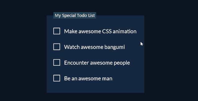
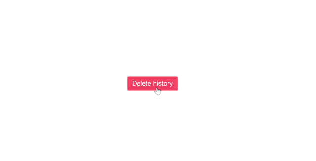
# 动态删除线
点击查看代码
<form>
  <fieldset class="todo-list">
    <legend class="todo-list__title">My Special Todo List</legend>
    <label class="todo-list__label">
      <input type="checkbox" name="" id="" />
      <i class="check"></i>
      <span>Make awesome CSS animation</span>
    </label>
    <label class="todo-list__label">
      <input type="checkbox" name="" id="" />
      <i class="check"></i>
      <span>Watch awesome bangumi</span>
    </label>
    <label class="todo-list__label">
      <input type="checkbox" name="" id="" />
      <i class="check"></i>
      <span>Encounter awesome people</span>
    </label>
    <label class="todo-list__label">
      <input type="checkbox" name="" id="" />
      <i class="check"></i>
      <span>Be an awesome man</span>
    </label>
  </fieldset>
</form>
<style>
// color scheme: https://coolors.co/e63946-585b57-7b9fa1-264456-0b1420
@import url("https://fonts.googleapis.com/css?family=Lato:400,400i,700");

body {
  display: flex;
  justify-content: center;
  align-items: center;
  height: 100vh;
  background: #1A1E23;
}

.todo-list {
  display: flex;
  flex-direction: column;
  padding: 0 75px 10px 30px;
  background: #162740;
  border: transparent;

  .todo-list__title {
    padding: 3px 6px;
    color: #f1faee;
    background-color: #264456;
  }

  .todo-list__label {
    display: flex;
    align-items: center;
    margin: 40px 0;
    font-size: 24px;
    font-family: Lato, sans-serif;
    color: #f1faee;
    cursor: pointer;

    input[type="checkbox"] {
      opacity: 0;
      appearance: none;

      & + .check {
        position: absolute;
        width: 25px;
        height: 25px;
        border: 2px solid #f1faee;
        transition: 0.2s;
      }

      &:checked + .check {
        width: 25px;
        height: 15px;
        border-top: transparent;
        border-right: transparent;
        transform: rotate(-45deg);
      }

      & ~ span {
        position: relative;
        left: 40px;
        white-space: nowrap;
        transition: 0.5s;

        &::before {
          position: absolute;
          content: "";
          top: 50%;
          left: 0;
          width: 100%;
          height: 1px;
          background: #f1faee;
          transform: scaleX(0);
          transform-origin: right;
          transition: transform 0.5s;
        }
      }

      &:checked ~ span {
        color: #585b57;

        &::before {
          transform: scaleX(1);
          transform-origin: left;
        }
      }
    }
  }
}

</style>
1
2
3
4
5
6
7
8
9
10
11
12
13
14
15
16
17
18
19
20
21
22
23
24
25
26
27
28
29
30
31
32
33
34
35
36
37
38
39
40
41
42
43
44
45
46
47
48
49
50
51
52
53
54
55
56
57
58
59
60
61
62
63
64
65
66
67
68
69
70
71
72
73
74
75
76
77
78
79
80
81
82
83
84
85
86
87
88
89
90
91
92
93
94
95
96
97
98
99
100
101
102
103
104
105
106
107
108
109
110
111
112
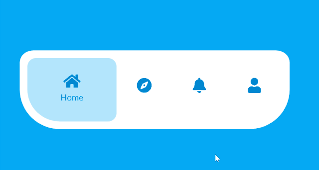
# border-radius
点击查看代码
<nav class="navtab">
  <ul>
    <li class="navtab-item active">
      <svg t="1580196202692" class="icon" viewBox="0 0 1024 1024" version="1.1" xmlns="http://www.w3.org/2000/svg" p-id="781" width="36" height="36"><path d="M555.541333 117.994667l312.874667 224.565333A117.333333 117.333333 0 0 1 917.333333 437.866667V800c0 64.8-52.533333 117.333333-117.333333 117.333333H640V746.666667c0-70.688-57.312-128-128-128s-128 57.312-128 128v170.666666H224c-64.8 0-117.333333-52.533333-117.333333-117.333333V437.877333a117.333333 117.333333 0 0 1 48.917333-95.317333l312.874667-224.565333a74.666667 74.666667 0 0 1 87.082666 0z" p-id="782" fill="currentColor"></path></svg>
      <span>Home</span>
    </li>
    <li class="navtab-item">
      <svg t="1580196351612" class="icon" viewBox="0 0 1024 1024" version="1.1" xmlns="http://www.w3.org/2000/svg" p-id="1159" width="36" height="36"><path d="M512 85.333333c235.637333 0 426.666667 191.029333 426.666667 426.666667S747.637333 938.666667 512 938.666667 85.333333 747.637333 85.333333 512 276.362667 85.333333 512 85.333333z m149.162667 222.901334L444.16 386.357333a96 96 0 0 0-57.802667 57.813334l-78.122666 216.992a42.666667 42.666667 0 0 0 54.602666 54.602666l217.002667-78.122666a96 96 0 0 0 57.802667-57.813334l78.122666-216.992a42.666667 42.666667 0 0 0-54.602666-54.602666zM512 565.333333a53.333333 53.333333 0 1 0 0-106.666666 53.333333 53.333333 0 0 0 0 106.666666z" p-id="1160" fill="currentColor"></path></svg>
      <span>Explore</span>
    </li>
    <li class="navtab-item">
      <svg t="1580196428669" class="icon" viewBox="0 0 1024 1024" version="1.1" xmlns="http://www.w3.org/2000/svg" p-id="2609" width="30" height="30"><path d="M335.008 916.629333c-35.914667 22.314667-82.88 10.773333-104.693333-25.557333a77.333333 77.333333 0 0 1-8.96-57.429333l46.485333-198.24a13.141333 13.141333 0 0 0-4.021333-12.864l-152.16-132.586667c-31.605333-27.52-35.253333-75.648-8.234667-107.733333a75.68 75.68 0 0 1 51.733333-26.752L354.848 339.2c4.352-0.362667 8.245333-3.232 10.026667-7.594667l76.938666-188.170666c16.032-39.2 60.618667-57.92 99.52-41.461334a76.309333 76.309333 0 0 1 40.832 41.461334l76.938667 188.16c1.781333 4.373333 5.674667 7.253333 10.026667 7.605333l199.712 16.277333c41.877333 3.413333 72.885333 40.458667 69.568 82.517334a76.938667 76.938667 0 0 1-26.08 51.978666l-152.16 132.586667c-3.541333 3.082667-5.141333 8.074667-4.021334 12.853333l46.485334 198.24c9.621333 41.013333-15.36 82.336-56.138667 92.224a75.285333 75.285333 0 0 1-57.525333-9.237333l-170.976-106.24a11.296 11.296 0 0 0-12.010667 0l-170.986667 106.24z" p-id="2610" fill="currentColor"></path></svg>
      <span>Collection</span>
    </li>
    <li class="navtab-item">
      <svg t="1580196480651" class="icon" viewBox="0 0 1024 1024" version="1.1" xmlns="http://www.w3.org/2000/svg" p-id="2891" width="30" height="30"><path d="M512 85.333333c235.637333 0 426.666667 191.029333 426.666667 426.666667S747.637333 938.666667 512 938.666667 85.333333 747.637333 85.333333 512 276.362667 85.333333 512 85.333333z m0 586.666667a32 32 0 1 0 0 64 32 32 0 0 0 0-64z m-2.517333-373.333333c-48.416 0-92.746667 24.16-118.613334 63.413333a137.088 137.088 0 0 0-15.978666 33.237333 32 32 0 0 0 60.906666 19.690667c2.016-6.24 4.885333-12.202667 8.522667-17.717333C458.4 375.914667 482.709333 362.666667 509.482667 362.666667 552.277333 362.666667 586.666667 396.266667 586.666667 437.333333s-34.4 74.666667-77.194667 74.666667a32 32 0 0 0-32 32v64a32 32 0 0 0 64 0v-35.584C603.946667 558.197333 650.666667 503.232 650.666667 437.333333c0-76.757333-63.381333-138.666667-141.194667-138.666666z" p-id="2892" fill="currentColor"></path></svg>
      <span>Help</span>
    </li>
  </ul>
</nav>

<style>
  @import url(https://fonts.googleapis.com/css?family=Lato);

@mixin center {
  display: flex;
  justify-content: center;
  align-items: center;
}

body {
  @include center;
  height: 100vh;
  font-family: Lato, sans-serif;
  background: #ECEFFC;
}

.navtab {
  --navtab-width: 600px;
  --navtab-item-width: calc(var(--navtab-width) / 4 - 20px);
  --navtab-overlay-width: calc(var(--navtab-item-width) + 80px);
  --active-index: 0;

  position: relative;
  width: var(--navtab-width);
  height: 150px;
  background: white;
  border: 1em solid white;
  // https://9elements.github.io/fancy-border-radius/full-control.html#15.5.15.15-50.95.50.85-150.600
  border-radius: 5% 5% 15% 15% / 15% 15% 50% 50%;
  overflow: hidden;

  ul {
    @include center;
    width: 100%;
    height: 100%;
    padding: 0;
    margin: 0;
    list-style-type: none;

    .navtab-item {
      @include center;
      z-index: 2;
      flex-direction: column;
      width: var(--navtab-item-width);
      height: 100%;
      color: #0288d1;
      cursor: pointer;
      transition: 0.5s ease;

      svg {
        transition: 0.5s ease;
      }

      span {
        font-size: 20px;
        user-select: none;
        opacity: 0;
        transition: 0.5s ease;
      }

      &.active {
        width: var(--navtab-overlay-width);

        svg {
          transform: translateY(-10px);
        }

        span {
          opacity: 1;
        }
      }
    }
  }

  &::after {
    position: absolute;
    content: "";
    top: 0;
    left: 0;
    height: 100%;
    width: var(--navtab-overlay-width);
    background: #b3e5fc;
    border-radius: 20px;
    transform: translateX(calc(var(--navtab-item-width) * var(--active-index)));
    transition: 0.5s ease;
  }
}

</style>

<script>
  let navtab = document.querySelector("nav.navtab");
  let navtabItems = document.querySelectorAll("li.navtab-item");
  navtabItems.forEach((navtabItem, activeIndex) =>
    navtabItem.addEventListener("click", () => {
      navtabItems.forEach(navtabItem => navtabItem.classList.remove("active"));
      navtabItem.classList.add("active");
      (navtab as HTMLElement).style.setProperty(
        "--active-index",
        `${activeIndex}`
      );
    })
  );

</script>
1
2
3
4
5
6
7
8
9
10
11
12
13
14
15
16
17
18
19
20
21
22
23
24
25
26
27
28
29
30
31
32
33
34
35
36
37
38
39
40
41
42
43
44
45
46
47
48
49
50
51
52
53
54
55
56
57
58
59
60
61
62
63
64
65
66
67
68
69
70
71
72
73
74
75
76
77
78
79
80
81
82
83
84
85
86
87
88
89
90
91
92
93
94
95
96
97
98
99
100
101
102
103
104
105
106
107
108
109
110
111
112
113
114
115
116
117
118
119
120
121
122
123
124
125
126
# box-shadow立体效果
点击查看代码
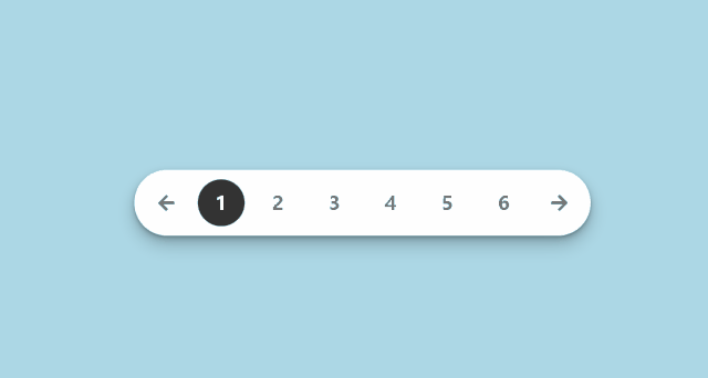
<ul class="pagination">
  <li class="page-prev">
    <a class="prev" href="#"><svg t="1580195949197" class="icon" viewBox="0 0 1024 1024" version="1.1" xmlns="http://www.w3.org/2000/svg" p-id="4493" width="20" height="20"><path d="M906.78272 588.78976c-0.02048 8.4992-6.88128 15.36-15.38048 15.37024l-443.6992-0.01024 75.70432 191.68256c2.51904 6.42048 0.48128 13.76256-5.03808 17.90976-5.51936 4.16768-13.13792 4.1472-18.61632-0.09216l-376.5248-289.47456c-3.77856-2.89792-6.00064-7.41376-6.00064-12.16512 0-4.78208 2.22208-9.27744 6.00064-12.1856l376.5248-289.47456c2.7648-2.11968 6.06208-3.19488 9.37984-3.19488 3.23584 0 6.5024 1.03424 9.23648 3.10272 5.51936 4.1472 7.5776 11.48928 5.03808 17.90976L447.68256 419.84l443.71968-0.01024c8.4992 0.01024 15.36 6.88128 15.36 15.36L906.78272 588.78976z" p-id="4494" fill="#777777"></path></svg></a>
  </li>
  <li class="page-number active"><a href="#">1</a></li>
  <li class="page-number"><a href="#">2</a></li>
  <li class="page-number"><a href="#">3</a></li>
  <li class="page-number"><a href="#">4</a></li>
  <li class="page-number"><a href="#">5</a></li>
  <li class="page-number"><a href="#">6</a></li>
  <li class="page-next">
    <a class="next" href="#"><svg t="1580195920917" class="icon" viewBox="0 0 1024 1024" version="1.1" xmlns="http://www.w3.org/2000/svg" p-id="4995" width="20" height="20"><path d="M906.77248 512c0 4.77184-2.21184 9.2672-5.9904 12.17536l-376.5248 289.4848c-2.7648 2.11968-6.06208 3.18464-9.3696 3.18464-3.25632 0-6.5024-1.03424-9.24672-3.09248-5.50912-4.15744-7.5776-11.48928-5.03808-17.90976l75.71456-191.67232L132.58752 604.17024c-8.48896 0-15.36-6.88128-15.36-15.36l0-153.6c0-8.48896 6.87104-15.36 15.36-15.36l443.72992 0-75.71456-191.68256c-2.53952-6.42048-0.47104-13.75232 5.04832-17.90976 5.50912-4.15744 13.12768-4.13696 18.60608 0.09216l376.5248 289.4848C904.56064 502.7328 906.77248 507.22816 906.77248 512z" p-id="4996" fill="#777777"></path></svg></a>
  </li>
</ul>

<style>
body {
  display: flex;
  justify-content: center;
  align-items: center;
  height: 100vh;
  background: #ECEFFC;
}

.pagination {
  --active-index: 0;
  display: flex;
  padding: 10px 20px;
  background: white;
  border-radius: 50px;
  box-shadow:
  0 0.3px 0.6px rgba(0, 0, 0, 0.056),
  0 0.7px 1.3px rgba(0, 0, 0, 0.081),
  0 1.3px 2.5px rgba(0, 0, 0, 0.1),
  0 2.2px 4.5px rgba(0, 0, 0, 0.119),
  0 4.2px 8.4px rgba(0, 0, 0, 0.144),
  0 10px 20px rgba(0, 0, 0, 0.2)
;
  list-style-type: none;

  li {
    margin: 0 5px;

    &.page-number {
      width: 50px;
      height: 50px;
      line-height: 50px;
      text-align: center;

      &:hover a {
        color: white;
        background: #777;
      }

      &.active a {
        color: white;
        background: #333;
      }
    }

    &.page-prev,
    &.page-next {
      font-weight: 700;
    }

    &.page-prev {
      margin-right: 20px;
    }

    &.page-next {
      margin-left: 20px;
    }

    a {
      display: block;
      line-height: 50px;
      font-size: 20px;
      font-weight: 600;
      text-decoration: none;
      color: #777;
      border-radius: 50%;
      transition: 0.3s;

      &.prev:hover path,
      &.next:hover path {
        fill: darken(#777, 50%);
      }
    }
  }
}

</style>

<script>
  let prevLink = document.querySelector(".prev");
let nextLink = document.querySelector(".next");
let pagination = document.querySelector(".pagination");
let pageNumberLinks = document.querySelectorAll(".page-number a");
let maxPageIndex = pageNumberLinks.length - 1;
pageNumberLinks.forEach((pageNumberLink, activeIndex) => {
  pageNumberLink.addEventListener("click", () => {
    pageNumberLinks.forEach(pageNumberLink =>
      pageNumberLink.parentElement.classList.remove("active")
    );
    pageNumberLink.parentElement.classList.add("active");
    (pagination as HTMLElement).style.setProperty(
      "--active-index",
      `${activeIndex}`
    );
  });
});
prevLink.addEventListener("click", () => {
  pageNumberLinks.forEach(pageNumberLink =>
    pageNumberLink.parentElement.classList.remove("active")
  );
  let activeIndex = Number(
    (pagination as HTMLElement).style.getPropertyValue("--active-index")
  );
  activeIndex = activeIndex > 0 ? activeIndex - 1 : 0;
  pageNumberLinks[activeIndex].parentElement.classList.add("active");
  (pagination as HTMLElement).style.setProperty(
    "--active-index",
    `${activeIndex}`
  );
});
nextLink.addEventListener("click", () => {
  pageNumberLinks.forEach(pageNumberLink =>
    pageNumberLink.parentElement.classList.remove("active")
  );
  let activeIndex = Number(
    (pagination as HTMLElement).style.getPropertyValue("--active-index")
  );
  activeIndex = activeIndex < maxPageIndex ? activeIndex + 1 : maxPageIndex;
  pageNumberLinks[activeIndex].parentElement.classList.add("active");
  (pagination as HTMLElement).style.setProperty(
    "--active-index",
    `${activeIndex}`
  );
});

</script>
1
2
3
4
5
6
7
8
9
10
11
12
13
14
15
16
17
18
19
20
21
22
23
24
25
26
27
28
29
30
31
32
33
34
35
36
37
38
39
40
41
42
43
44
45
46
47
48
49
50
51
52
53
54
55
56
57
58
59
60
61
62
63
64
65
66
67
68
69
70
71
72
73
74
75
76
77
78
79
80
81
82
83
84
85
86
87
88
89
90
91
92
93
94
95
96
97
98
99
100
101
102
103
104
105
106
107
108
109
110
111
112
113
114
115
116
117
118
119
120
121
122
123
124
125
126
127
128
129
130
131
132
133
134
135
136
137
138
139
140
141
# box-shadow 遮罩
点击查看代码
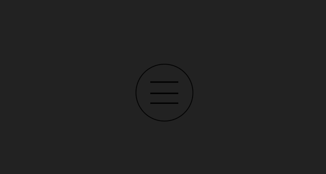
<input type="checkbox" id="burger-toggle">
<label for="burger-toggle" class="burger-menu">
  <div class="line"></div>
  <div class="line"></div>
  <div class="line"></div>
</label>
<div class="overlay"></div>

<style>
body {
  display: flex;
  justify-content: center;
  align-items: center;
  min-height: 100vh;
  margin: 0;
  overflow: hidden;
  background: #ECEFFC;
}

#burger-toggle {
  appearance: none;
  opacity: 0;

  &:checked {

    // Here don't use box-shadow to make overlay because it will damage performance.
    &~.overlay {
      opacity: 1;
      transform: scale(160);
    }

    &~.burger-menu {
      .line {
        &:nth-child(1) {
          transform: translateY(calc(var(--burger-menu-radius) / 5)) rotate(45deg);
        }

        &:nth-child(2) {
          transform: scaleX(0);
        }

        &:nth-child(3) {
          transform: translateY(calc(var(--burger-menu-radius) / -5)) rotate(-45deg);
        }
      }
    }
  }
}

.burger-menu {
  --burger-menu-radius: 4em;
  position: relative;
  z-index: 100;
  display: block;
  width: var(--burger-menu-radius);
  height: var(--burger-menu-radius);
  background: white;
  border: solid 2px hsla(184, 9%, 62%, 0.4);
  border-radius: 50%;
  outline: none;
  cursor: pointer;
  transition: 0.5s ease-in-out;

  .line {
    position: absolute;
    left: 25%;
    width: 50%;
    height: 3px;
    background: hsla(210, 29%, 24%, 0.3);
    border-radius: 10px;
    overflow: hidden;
    transition: all 0.5s ease;

    &:nth-child(1) {
      top: 30%;
    }

    &:nth-child(2) {
      top: 50%;
    }

    &:nth-child(3) {
      top: 70%;
    }

    &::after {
      position: absolute;
      content: "";
      top: 0;
      left: 0;
      width: 100%;
      height: 100%;
      background: #2980b9;
      transform: translateX(-100%);
      transition: all 0.25s ease;
    }

    @for $i from 2 through 3 {
      &:nth-child(#{$i})::after {
        transition-delay: 0.1s * ($i - 1);
      }
    }
  }

  &:hover {
    box-shadow:
      0.4px 0.4px 0.8px rgba(0, 0, 0, 0.042),
      1px 1px 2px rgba(0, 0, 0, 0.061),
      1.9px 1.9px 3.8px rgba(0, 0, 0, 0.075),
      3.4px 3.4px 6.7px rgba(0, 0, 0, 0.089),
      6.3px 6.3px 12.5px rgba(0, 0, 0, 0.108),
      15px 15px 30px rgba(0, 0, 0, 0.15);

    .line::after {
      transform: translateX(0);
    }
  }
}

.overlay {
  position: absolute;
  width: 2em;
  height: 2em;
  background: hsla(204, 64%, 44%, 0.9);
  border-radius: 50%;
  opacity: 0;
  transition: 0.5s ease-in-out;
  will-change: transform;
}
</style>
1
2
3
4
5
6
7
8
9
10
11
12
13
14
15
16
17
18
19
20
21
22
23
24
25
26
27
28
29
30
31
32
33
34
35
36
37
38
39
40
41
42
43
44
45
46
47
48
49
50
51
52
53
54
55
56
57
58
59
60
61
62
63
64
65
66
67
68
69
70
71
72
73
74
75
76
77
78
79
80
81
82
83
84
85
86
87
88
89
90
91
92
93
94
95
96
97
98
99
100
101
102
103
104
105
106
107
108
109
110
111
112
113
114
115
116
117
118
119
120
121
122
123
124
125
126
127
128
129
130
# box-shadow内发光
点击查看代码
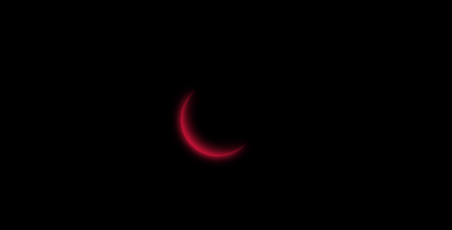
<div class="loading"></div>

<style>
  body {
  display: flex;
  justify-content: center;
  align-items: center;
  height: 100vh;
  background: black;
}

.loading {
  position: relative;
  width: 8em;
  height: 8em;
  background: black;
  border-radius: 50%;
  box-shadow: inset 0.5em -0.5em crimson;
  animation: spin 2s linear infinite;

  &::before,
  &::after {
    position: absolute;
    content: "";
    width: 100%;
    height: 100%;
    background: inherit;
    border-radius: inherit;
    box-shadow: inherit;
  }

  &::before {
    filter: blur(5px);
  }

  &::after {
    filter: blur(10px);
  }
}

@keyframes spin {
  to {
    transform: rotate(1turn);
  }
}

</style>
1
2
3
4
5
6
7
8
9
10
11
12
13
14
15
16
17
18
19
20
21
22
23
24
25
26
27
28
29
30
31
32
33
34
35
36
37
38
39
40
41
42
43
44
45
46
47
2
3
4
5
6
7
8
9
10
11
12
13
14
15
16
17
18
19
20
21
22
23
24
25
26
27
28
29
30
31
32
33
34
35
36
37
38
39
40
41
42
43
44
45
46
47
# 发光文本
点击查看代码
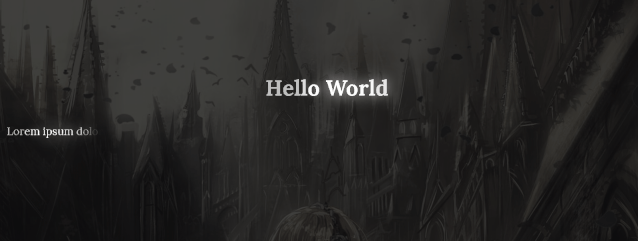
<h1 class="glowIn">Hello World</h1>
<style>
body {
  display: flex;
  flex-direction: column;
  height: 100vh;
  justify-content: center;
  align-items: center;
  background-image: linear-gradient(
      rgba(16, 16, 16, 0.8),
      rgba(16, 16, 16, 0.8)
    );
  background-size: cover;
}

h1 {
  text-align: left;
  line-height: 1.8;
  font-family: Lora, serif;
}

.glowIn {
  color: white;
}

.glowIn span {
  animation: glow-in 0.8s both;
}
@keyframes glow-in {
  from {
    opacity: 0;
  }
  65% {
    opacity: 1;
    text-shadow: 0 0 25px white;
  }
  75% {
    opacity: 1;
  }
  to {
    opacity: 0.7;
  }
}

</style>

<script>
let glowInTexts = document.querySelectorAll(".glowIn");
glowInTexts.forEach(glowInText => {
  let letters = glowInText.textContent.split("");
  glowInText.textContent = "";
  letters.forEach((letter, i) => {
    let span = document.createElement("span");
    span.textContent = letter;
    span.style.animationDelay = `${i * 0.05}s`;
    glowInText.append(span);
  });
});

</script>
1
2
3
4
5
6
7
8
9
10
11
12
13
14
15
16
17
18
19
20
21
22
23
24
25
26
27
28
29
30
31
32
33
34
35
36
37
38
39
40
41
42
43
44
45
46
47
48
49
50
51
52
53
54
55
56
57
58
59
60
2
3
4
5
6
7
8
9
10
11
12
13
14
15
16
17
18
19
20
21
22
23
24
25
26
27
28
29
30
31
32
33
34
35
36
37
38
39
40
41
42
43
44
45
46
47
48
49
50
51
52
53
54
55
56
57
58
59
60
# 霓虹文本

点击查看代码
<div class="neon">fushigi no monogatari</div>

<style>
  @import url(https://fonts.googleapis.com/css?family=Pacifico);

body {
  display: flex;
  height: 100vh;
  justify-content: center;
  align-items: center;
  text-align: center;
  background: black;
}

.neon {
  color: #cce7f8;
  font-size: 2.5rem;
  font-family: 'Pacifico', cursive;
  text-transform: uppercase;
  animation: shining 0.1s alternate infinite;
}

@keyframes shining {
  from {
    text-shadow: 0 0 6px rgba(182, 211, 207, 0.9),
      0 0 30px rgba(182, 211, 207, 0.3), 0 0 12px rgba(15, 115, 223, 0.5),
      0 0 21px rgba(15, 115, 223, 0.9), 0 0 34px rgba(15, 115, 223, 0.8),
      0 0 54px rgba(15, 115, 223, 0.9);
  }
  to {
    text-shadow: 0 0 6px rgba(182, 211, 207, 1),
      0 0 30px rgba(182, 211, 207, 0.4), 0 0 12px rgba(15, 115, 223, 0.6),
      0 0 22px rgba(15, 115, 223, 0.8), 0 0 38px rgba(15, 115, 223, 0.9),
      0 0 60px rgba(15, 115, 223, 1);
  }
}

</style>
1
2
3
4
5
6
7
8
9
10
11
12
13
14
15
16
17
18
19
20
21
22
23
24
25
26
27
28
29
30
31
32
33
34
35
36
37
38
2
3
4
5
6
7
8
9
10
11
12
13
14
15
16
17
18
19
20
21
22
23
24
25
26
27
28
29
30
31
32
33
34
35
36
37
38
# 伪3D文本

点击查看代码
<div class="loading">Loading</div>

<style>
  @import url("https://fonts.googleapis.com/css?family=Baloo+Bhaijaan&display=swap");

@function float-text-3d($shadow-color: #bbb, $depth: 10, $floating: false) {
  $shadows: ();

  // When dropped, it will shrink like a spring. When floating, it grows into its shape.
  @for $i from 1 to $depth {
    @if ($floating == false and $i > $depth / 2) {
      $shadow-color: transparent;
    }
    $shadows: append($shadows, 0 ($i * 1px) $shadow-color, comma);
  }

  // When dropped, the shadow reveals. When floating, the shadow fades.
  @if ($floating == false) {
    $shadows: append($shadows, 0 10px 10px rgba(0, 0, 0, 0.4), comma);
  } @else {
    $shadows: append($shadows, 0 50px 25px rgba(0, 0, 0, 0.2), comma);
  }

  @return $shadows;
}

body {
  display: flex;
  height: 100vh;
  justify-content: center;
  align-items: center;
  text-align: center;
  background: #2980b9;
}

.loading {
  display: flex;
  color: white;
  font-size: 5em;
  font-family: "Baloo Bhaijaan", cursive;
  text-transform: uppercase;

  span {
    text-shadow: float-text-3d($floating: false);
    transform: translateY(20px);
    animation: bounce 0.3s ease infinite alternate;
  }
}

@keyframes bounce {
  to {
    text-shadow: float-text-3d($floating: true);
    transform: translateY(-20px);
  }
}
</style>
<script>
  let loading = document.querySelector(".loading");
  let letters = loading.textContent.split("");
  loading.textContent = "";
  letters.forEach((letter, i) => {
    let span = document.createElement("span");
    span.textContent = letter;
    span.style.animationDelay = `${i / 10}s`;
    loading.append(span);
  });

</script>
1
2
3
4
5
6
7
8
9
10
11
12
13
14
15
16
17
18
19
20
21
22
23
24
25
26
27
28
29
30
31
32
33
34
35
36
37
38
39
40
41
42
43
44
45
46
47
48
49
50
51
52
53
54
55
56
57
58
59
60
61
62
63
64
65
66
67
68
2
3
4
5
6
7
8
9
10
11
12
13
14
15
16
17
18
19
20
21
22
23
24
25
26
27
28
29
30
31
32
33
34
35
36
37
38
39
40
41
42
43
44
45
46
47
48
49
50
51
52
53
54
55
56
57
58
59
60
61
62
63
64
65
66
67
68
# background-clip:text

点击查看代码
<ul>
  <li><a href="#">home</a></li>
  <li><a href="#">archives</a></li>
  <li><a href="#">tags</a></li>
  <li><a href="#">categories</a></li>
  <li><a href="#">about</a></li>
</ul>

<style>
  // https://picular.co/bluemoon

@import url("https://fonts.googleapis.com/css?family=Raleway:400,400i,700");

body {
  display: flex;
  height: 100vh;
  justify-content: center;
  align-items: center;
  text-align: center;
  background: #1A1E23;
}

ul {
  display: flex;
  flex-direction: column;
  align-items: start;
  list-style-type: none;

  li {
    padding: 6px 0;

    a {
      --fill-color: #198CE6;
      position: relative;
      display: block;
      padding: 4px 0;
      font: 700 3rem Raleway, sans-serif;
      text-decoration: none;
      text-transform: uppercase;
      -webkit-text-stroke: 2px var(--fill-color);
      background: linear-gradient(var(--fill-color) 0 100%) left / 0 no-repeat;
      color: transparent;
      background-clip: text;
      transition: 0.5s linear;

      &:hover {
        background-size: 100%;
      }
    }
  }
}
</style>
1
2
3
4
5
6
7
8
9
10
11
12
13
14
15
16
17
18
19
20
21
22
23
24
25
26
27
28
29
30
31
32
33
34
35
36
37
38
39
40
41
42
43
44
45
46
47
48
49
50
51
52
2
3
4
5
6
7
8
9
10
11
12
13
14
15
16
17
18
19
20
21
22
23
24
25
26
27
28
29
30
31
32
33
34
35
36
37
38
39
40
41
42
43
44
45
46
47
48
49
50
51
52
# linear-gradient
点击查看代码
<dialog id="confirm-modal" class="modal">
  <div class="modal-content">
    <svg t="1574164208713" class="model-icon" viewBox="0 0 1024 1024" version="1.1" xmlns="http://www.w3.org/2000/svg" p-id="5819" width="63" height="63"><path d="M512 0C230.4 0 0 230.4 0 512s230.4 512 512 512 512-230.4 512-512S793.6 0 512 0zM512 877.714286c-40.228571 0-73.142857-32.914286-73.142857-73.142857s32.914286-73.142857 73.142857-73.142857 73.142857 32.914286 73.142857 73.142857S552.228571 877.714286 512 877.714286zM585.142857 512c0 40.228571-32.914286 73.142857-73.142857 73.142857s-73.142857-32.914286-73.142857-73.142857L438.857143 219.428571c0-40.228571 32.914286-73.142857 73.142857-73.142857s73.142857 32.914286 73.142857 73.142857L585.142857 512z" p-id="5820" fill="white"></path></svg>
    <h2 class="modal-title">Are you sure?</h2>
    <p class="modal-description">
      You can't undo this action.
    </p>
    <div class="modal-options">
      <button
        class="btn btn-round btn-fill btn-fill-left option confirm"
        data-text="Yes"
        onclick="document.querySelector('#confirm-modal').close()"
      ></button>
      <button
        class="btn btn-round btn-fill btn-fill-right option cancel"
        data-text="No"
        onclick="document.querySelector('#confirm-modal').close()"
      ></button>
    </div>
  </div>
</dialog>
<form action="javascript:void(0);">
  <button
    class="btn btn-danger"
    onclick="document.querySelector('#confirm-modal').showModal()"
  >
    Delete history
  </button>
</form>
<style>
  @import url(https://fonts.googleapis.com/css?family=Lato);

:root {
  --primary-color: hsl(171, 100%, 41%);
  --success-color: hsl(141, 53%, 53%);
  --danger-color: hsl(348, 86%, 61%);
}

body {
  display: flex;
  height: 100vh;
  justify-content: center;
  align-items: center;
  font-family: Lato, sans-serif;
  background: #ECEFFC;
}

.btn {
  position: relative;
  padding: 0.375rem 0.75rem;
  font-size: 1rem;
  line-height: 1.5;
  color: hsl(0, 0%, 13%);
  text-decoration: none;
  background-color: white;
  border: transparent;
  border-radius: 3px;
  outline: transparent;
  cursor: pointer;
  user-select: none;
  white-space: nowrap;
  transition: 0.25s;

  &-danger {
    color: white;
    background-color: var(--danger-color);

    &:hover {
      background-color: hsl(348, 86%, 53%);
    }
  }

  &-round {
    border-radius: 30px;
  }

  &-fill {
    overflow: hidden;

    &-left {
      &::before {
        transform: translateX(100%);
      }
    }

    &-right {
      &::before {
        transform: translateX(-100%);
      }
    }

    &::before {
      position: absolute;
      content: "";
      top: 0px;
      left: 0px;
      width: 100%;
      height: 100%;
      border-radius: inherit;
      transition: 0.4s cubic-bezier(0.75, 0, 0.25, 1);
    }

    &::after {
      position: relative;
      content: attr(data-text);
      transition: 0.4s ease;
    }

    &:hover::before {
      transform: translateX(0);
    }

    &:hover::after {
      color: white !important;
    }
  }
}

.modal {
  position: fixed;
  top: 0;
  left: 0;
  bottom: 0;
  right: 0;
  z-index: 999;
  color: white;
  background-image: linear-gradient(to right, #0acffe 0%, #495aff 100%);
  border: transparent;
  border-radius: 12px;
  box-shadow: 0 2.8px 2.2px rgba(0, 0, 0, 0.02),
    0 6.7px 5.3px rgba(0, 0, 0, 0.028), 0 12.5px 10px rgba(0, 0, 0, 0.035),
    0 22.3px 17.9px rgba(0, 0, 0, 0.042), 0 41.8px 33.4px rgba(0, 0, 0, 0.05),
    0 100px 80px rgba(0, 0, 0, 0.07);
  animation: show-modal 0.5s ease forwards;

  &::backdrop {
    background: rgba(0, 0, 0, 0.4);
    backdrop-filter: blur(3px);
  }

  .model-icon {
    margin-bottom: 1.25rem;
    opacity: 0;
    animation: show-modal-icon 0.5s ease 0.2s forwards;
  }

  .modal-content {
    display: flex;
    flex-direction: column;
    align-items: center;
    width: 300px;
    padding: 1em;

    .modal-title {
      margin-top: 0;
      margin-bottom: 1.2rem;
      opacity: 0;
      animation: show-modal-text 0.5s ease 0.35s forwards;
    }

    .modal-description {
      margin: 0;
      opacity: 0;
      animation: show-modal-text 1s ease 0.5s forwards;
    }

    .modal-options {
      margin-top: 1rem;
      display: flex;
      justify-content: space-around;

      .option {
        padding: 0 2em;
        margin: 0.3em;
        font-size: 20px;
        font-weight: 700;
        line-height: 2;
      }

      .confirm {
        opacity: 0;
        animation: show-modal-option 0.5s ease 0.65s forwards;

        &::before {
          background: var(--success-color);
        }

        &::after {
          color: var(--success-color);
        }
      }

      .cancel {
        opacity: 0;
        animation: show-modal-option 0.5s ease 0.8s forwards;

        &::before {
          background: var(--danger-color);
        }

        &::after {
          color: var(--danger-color);
        }
      }
    }
  }
}

@keyframes show-modal {
  from {
    transform: scale(0.8);
  }

  50% {
    transform: scale(1.1);
    opacity: 1;
  }

  to {
    transform: scale(1);
    opacity: 1;
  }
}

@keyframes show-modal-icon {
  from {
    transform: scale(0.4);
  }

  50% {
    transform: scale(1.2);
    opacity: 1;
  }

  to {
    transform: scale(1);
    opacity: 1;
  }
}

@keyframes show-modal-text {
  from {
    transform: scale(0.6);
  }

  50% {
    transform: scale(1.2);
    opacity: 1;
  }

  to {
    transform: scale(1);
    opacity: 1;
  }
}

@keyframes show-modal-option {
  from {
    transform: scale(0.4);
  }

  50% {
    transform: scale(1.2);
    opacity: 1;
  }

  to {
    transform: scale(1);
    opacity: 1;
  }
}

</style>
1
2
3
4
5
6
7
8
9
10
11
12
13
14
15
16
17
18
19
20
21
22
23
24
25
26
27
28
29
30
31
32
33
34
35
36
37
38
39
40
41
42
43
44
45
46
47
48
49
50
51
52
53
54
55
56
57
58
59
60
61
62
63
64
65
66
67
68
69
70
71
72
73
74
75
76
77
78
79
80
81
82
83
84
85
86
87
88
89
90
91
92
93
94
95
96
97
98
99
100
101
102
103
104
105
106
107
108
109
110
111
112
113
114
115
116
117
118
119
120
121
122
123
124
125
126
127
128
129
130
131
132
133
134
135
136
137
138
139
140
141
142
143
144
145
146
147
148
149
150
151
152
153
154
155
156
157
158
159
160
161
162
163
164
165
166
167
168
169
170
171
172
173
174
175
176
177
178
179
180
181
182
183
184
185
186
187
188
189
190
191
192
193
194
195
196
197
198
199
200
201
202
203
204
205
206
207
208
209
210
211
212
213
214
215
216
217
218
219
220
221
222
223
224
225
226
227
228
229
230
231
232
233
234
235
236
237
238
239
240
241
242
243
244
245
246
247
248
249
250
251
252
253
254
255
256
257
258
259
260
261
262
263
264
265
266
267
268
269
270
271
272
273
# radial-gradient
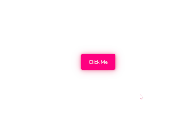
点击查看代码
<button class="btn btn-pink btn-bubbles">Click Me</button>
<style>
  @import url(https://fonts.googleapis.com/css?family=Lato);

body {
  display: flex;
  height: 100vh;
  justify-content: center;
  align-items: center;
  background: #ECEFFC;
}

@function sample($list) {
  @return nth($list, random(length($list)));
}

@function bubbles($color, $count: 16) {
  $bubbles: ();
  // define your own bubbles here!
  $bubble-types: (
    radial-gradient(circle, $color 20%, transparent 20%),
    radial-gradient(circle, transparent 20%, $color 20%, transparent 30%)
  );
  @for $i from 1 through $count {
    $bubbles: append($bubbles, sample($bubble-types), comma);
  }
  @return $bubbles;
}

@function random_range($min, $max) {
  $rand: random();
  $random_range: $min + floor($rand * (($max - $min) + 1));
  @return $random_range;
}

@function random_sizes($count: 16) {
  $sizes: ();
  @for $i from 1 through $count {
    $sizes: append(
      $sizes,
      (random_range(10, 20) * 1%) (random_range(10, 20) * 1%),
      comma
    );
  }
  @return $sizes;
}

.btn {
  --hue: 190;
  --btn-bg-color: hsl(var(--hue), 100%, 50%);
  --btn-bg-color-darker: hsl(var(--hue), 100%, 45%);
  position: relative;
  padding: 0.75rem 1.5rem;
  margin: 1rem;
  font-size: 1rem;
  font-family: Lato, sans-serif;
  line-height: 1.5;
  color: white;
  text-decoration: none;
  background-color: var(--btn-bg-color);
  border: 1px solid var(--btn-bg-color);
  border-radius: 4px;
  box-shadow:
  0 0.1px 0.7px rgba(233, 30, 99, 0.141),
  0 0.1px 1.7px rgba(233, 30, 99, 0.202),
  0 0.3px 3.1px rgba(233, 30, 99, 0.25),
  0 0.4px 5.6px rgba(233, 30, 99, 0.298),
  0 0.8px 10.4px rgba(233, 30, 99, 0.359),
  0 2px 25px rgba(233, 30, 99, 0.5)
;
  outline: transparent;
  overflow: hidden;
  cursor: pointer;
  user-select: none;
  white-space: nowrap;
  transition: 0.25s;

  &-pink {
    --hue: 330;
  }

  &-bubbles {
    overflow: visible;
    transition: transform ease-in 0.1s, background-color ease-in 0.1s,
      box-shadow ease-in 0.25s;

    &::before {
      position: absolute;
      content: "";
      left: -2em;
      right: -2em;
      top: -2em;
      bottom: -2em;
      transition: ease-in-out 0.5s;
      background-repeat: no-repeat;
      background-image: bubbles(var(--btn-bg-color));
      background-size: random_sizes();
      background-position: 18% 40%, 20% 31%, 30% 30%, 40% 30%, 50% 30%, 57% 30%,
        65% 30%, 80% 32%, 15% 60%, 83% 60%, 18% 70%, 25% 70%, 41% 70%, 50% 70%,
        64% 70%, 80% 71%;
      animation: bubbles ease-in-out 0.75s forwards;
    }

    &:active {
      transform: scale(0.95);
      background: var(--btn-bg-color-darker);

      &::before {
        // when the clicked mouse is up, trigger the animation.
        animation: none;
        background-size: 0;
      }
    }
  }
}

@keyframes bubbles {
  0% {
    background-position: 18% 40%, 20% 31%, 30% 30%, 40% 30%, 50% 30%, 57% 30%,
      65% 30%, 80% 32%, 15% 60%, 83% 60%, 18% 70%, 25% 70%, 41% 70%, 50% 70%,
      64% 70%, 80% 71%;
  }

  50% {
    background-position: 10% 44%, 0% 20%, 15% 5%, 30% 0%, 42% 0%, 62% -2%,
      75% 0%, 95% -2%, 0% 80%, 95% 55%, 7% 100%, 24% 100%, 41% 100%, 55% 95%,
      68% 96%, 95% 100%;
  }

  100% {
    background-position: 5% 44%, -5% 20%, 7% 5%, 23% 0%, 37% 0, 58% -2%, 80% 0%,
      100% -2%, -5% 80%, 100% 55%, 2% 100%, 23% 100%, 42% 100%, 60% 95%, 70% 96%,
      100% 100%;
    background-size: 0% 0%;
  }
}

</style>
1
2
3
4
5
6
7
8
9
10
11
12
13
14
15
16
17
18
19
20
21
22
23
24
25
26
27
28
29
30
31
32
33
34
35
36
37
38
39
40
41
42
43
44
45
46
47
48
49
50
51
52
53
54
55
56
57
58
59
60
61
62
63
64
65
66
67
68
69
70
71
72
73
74
75
76
77
78
79
80
81
82
83
84
85
86
87
88
89
90
91
92
93
94
95
96
97
98
99
100
101
102
103
104
105
106
107
108
109
110
111
112
113
114
115
116
117
118
119
120
121
122
123
124
125
126
127
128
129
130
131
132
133
134
135
136
137
138
# backdrop-filter
对背景应用滤镜,产生毛玻璃的效果
点击查看代码
<div class="frosted-glass">
  <h1 class="title">sakura</h1>
</div>
<style>
  @import url("https://fonts.googleapis.com/css?family=Lato:200");

body {
  display: flex;
  justify-content: center;
  align-items: center;
  height: 100vh;
  background: url(https://i.loli.net/2019/11/17/GAYyzeKsiWjP5qO.jpg);
  background-size: cover;
  background-position: center;
}

.frosted-glass {
  display: flex;
  justify-content: center;
  align-items: center;
  width: 72vw;
  height: 36vh;
  box-shadow: 0 0.3px 0.7px rgba(0, 0, 0, 0.126),
    0 0.9px 1.7px rgba(0, 0, 0, 0.179), 0 1.8px 3.5px rgba(0, 0, 0, 0.224),
    0 3.7px 7.3px rgba(0, 0, 0, 0.277), 0 10px 20px rgba(0, 0, 0, 0.4);
  backdrop-filter: blur(20px);
  transition: 0.5s ease;

  &:hover {
    box-shadow: 0 0.7px 1px rgba(0, 0, 0, 0.157),
      0 1.7px 2.6px rgba(0, 0, 0, 0.224), 0 3.5px 5.3px rgba(0, 0, 0, 0.28),
      0 7.3px 11px rgba(0, 0, 0, 0.346), 0 20px 30px rgba(0, 0, 0, 0.5);
  }

  .title {
    padding-left: 0.375em;
    font-size: 3.6em;
    font-family: Lato, sans-serif;
    font-weight: 200;
    letter-spacing: 0.75em;
    color: white;

    @media (max-width: 640px) {
      font-size: 2em;
    }
  }
}

</style>
1
2
3
4
5
6
7
8
9
10
11
12
13
14
15
16
17
18
19
20
21
22
23
24
25
26
27
28
29
30
31
32
33
34
35
36
37
38
39
40
41
42
43
44
45
46
47
48
49
2
3
4
5
6
7
8
9
10
11
12
13
14
15
16
17
18
19
20
21
22
23
24
25
26
27
28
29
30
31
32
33
34
35
36
37
38
39
40
41
42
43
44
45
46
47
48
49
# mix-blend-mode
PS里的混合模式,常用于文本在背景下的特殊效果以下利用滤色模式(screen)实现文本视频蒙版效果

点击查看代码
<video autoplay muted loop preload poster="https://s3-us-west-2.amazonaws.com/s.cdpn.io/4273/oceanshot.jpg">
  <source src="https://s3-us-west-2.amazonaws.com/s.cdpn.io/4273/ocean-small.webm" />
  <source src="http://thenewcode.com/assets/videos/ocean-small.mp4" />
</video>
<h1>ocean</h1>

<style>
  @font-face {
    font-family: Biko;
    src: url("https://s3-us-west-2.amazonaws.com/s.cdpn.io/4273/biko-black.woff");
  }

  body {
    display: flex;
    height: 100vh;
    justify-content: center;
    align-items: center;
    overflow: hidden;
  }

  video,
  h1 {
    position: absolute;
    top: 0;
    left: 0;
    width: 100%;
    height: 100%;
    margin: 0;
  }

  video {
    object-fit: cover;
  }

  h1 {
    font-size: 20vw;
    font-family: Biko, sans-serif;
    font-weight: 700;
    line-height: 100vh;
    text-transform: uppercase;
    text-align: center;
    background: white;
    mix-blend-mode: screen;
  }

</style>
1
2
3
4
5
6
7
8
9
10
11
12
13
14
15
16
17
18
19
20
21
22
23
24
25
26
27
28
29
30
31
32
33
34
35
36
37
38
39
40
41
42
43
44
45
46
2
3
4
5
6
7
8
9
10
11
12
13
14
15
16
17
18
19
20
21
22
23
24
25
26
27
28
29
30
31
32
33
34
35
36
37
38
39
40
41
42
43
44
45
46
# clip-path
点击查看代码
<div class="shadow">
  <div class="card">
    <div class="card-header">Contact</div>
    <div class="card-body">
      <dl>
        <span>
                <dt><a href="https://github.com/alphardex" target="_blank"><svg t="1580195147272" class="icon" viewBox="0 0 1024 1024" version="1.1" xmlns="http://www.w3.org/2000/svg" p-id="737" width="27" height="27"><path d="M950.930286 512q0 143.433143-83.748571 257.974857t-216.283429 158.573714q-15.433143 2.852571-22.601143-4.022857t-7.168-17.115429l0-120.539429q0-55.442286-29.696-81.115429 32.548571-3.437714 58.587429-10.313143t53.686857-22.308571 46.299429-38.034286 30.281143-59.977143 11.702857-86.016q0-69.12-45.129143-117.686857 21.138286-52.004571-4.534857-116.589714-16.018286-5.12-46.299429 6.290286t-52.589714 25.161143l-21.723429 13.677714q-53.174857-14.848-109.714286-14.848t-109.714286 14.848q-9.142857-6.290286-24.283429-15.433143t-47.689143-22.016-49.152-7.68q-25.161143 64.585143-4.022857 116.589714-45.129143 48.566857-45.129143 117.686857 0 48.566857 11.702857 85.723429t29.988571 59.977143 46.006857 38.253714 53.686857 22.308571 58.587429 10.313143q-22.820571 20.553143-28.013714 58.88-11.995429 5.705143-25.746286 8.557714t-32.548571 2.852571-37.449143-12.288-31.744-35.693714q-10.825143-18.285714-27.721143-29.696t-28.306286-13.677714l-11.410286-1.682286q-11.995429 0-16.603429 2.56t-2.852571 6.582857 5.12 7.972571 7.460571 6.875429l4.022857 2.852571q12.580571 5.705143 24.868571 21.723429t17.993143 29.110857l5.705143 13.165714q7.460571 21.723429 25.161143 35.108571t38.253714 17.115429 39.716571 4.022857 31.744-1.974857l13.165714-2.267429q0 21.723429 0.292571 50.834286t0.292571 30.866286q0 10.313143-7.460571 17.115429t-22.820571 4.022857q-132.534857-44.032-216.283429-158.573714t-83.748571-257.974857q0-119.442286 58.88-220.306286t159.744-159.744 220.306286-58.88 220.306286 58.88 159.744 159.744 58.88 220.306286z" p-id="738" fill="#4289ff"></path></svg></a></dt>
                <dd>alphardex</dd>
            </span>
        <span>
                <dt><a href="mailto:2582347430@qq.com"><svg t="1580195271469" class="icon" viewBox="0 0 1025 1024" version="1.1" xmlns="http://www.w3.org/2000/svg" p-id="9773" width="27" height="27"><path d="M1024.073143 405.723429l0 453.705143q0 37.741714-26.843429 64.585143t-64.585143 26.843429l-841.142857 0q-37.741714 0-64.585143-26.843429t-26.843429-64.585143l0-453.705143q25.161143 28.013714 57.709714 49.737143 206.848 140.580571 284.013714 197.12 32.548571 23.990857 52.882286 37.449143t53.979429 27.428571 62.829714 13.970286l1.170286 0q29.110857 0 62.829714-13.970286t53.979429-27.428571 52.882286-37.449143q97.133714-70.290286 284.598857-197.12 32.548571-22.308571 57.124571-49.737143zM1024.073143 237.714286q0 45.129143-28.013714 86.308571t-69.705143 70.290286q-214.820571 149.138286-267.410286 185.709714-5.705143 4.022857-24.283429 17.408t-30.866286 21.723429-29.696 18.578286-32.841143 15.433143-28.598857 5.12l-1.170286 0q-13.165714 0-28.598857-5.12t-32.841143-15.433143-29.696-18.578286-30.866286-21.723429-24.283429-17.408q-52.004571-36.571429-149.723429-104.301714t-117.174857-81.408q-35.401143-23.990857-66.852571-65.974857t-31.451429-77.970286q0-44.544 23.698286-74.313143t67.730286-29.696l841.142857 0q37.156571 0 64.292571 26.843429t27.136 64.585143z" p-id="9774" fill="#4289ff"></path></svg></a></dt>
                <dd>2582347430@qq.com</dd>
            </span>
        <span>
                <dt><a href="tel:+8613063509980"><svg t="1580195327065" class="icon" viewBox="0 0 1024 1024" version="1.1" xmlns="http://www.w3.org/2000/svg" p-id="10241" width="27" height="27"><path d="M914.285714 708.534857q0 15.433143-5.705143 40.301714t-11.995429 39.131429q-11.995429 28.598857-69.705143 60.562286-53.686857 29.110857-106.276571 29.110857-15.433143 0-29.988571-1.974857t-32.841143-7.168-27.136-8.265143-31.744-11.702857-28.013714-10.313143q-56.027429-19.968-99.986286-47.396571-73.142857-45.129143-151.113143-123.172571t-123.172571-151.113143q-27.428571-44.032-47.396571-99.986286-1.682286-5.12-10.313143-28.013714t-11.702857-31.744-8.265143-27.136-7.168-32.841143-1.974857-29.988571q0-52.589714 29.110857-106.276571 32.036571-57.709714 60.562286-69.705143 14.262857-6.290286 39.131429-11.995429t40.301714-5.705143q7.972571 0 11.995429 1.682286 10.313143 3.437714 30.281143 43.446857 6.290286 10.825143 17.115429 30.866286t19.968 36.278857 17.700571 30.573714q1.682286 2.267429 10.020571 14.262857t12.288 20.260571 4.022857 16.310857q0 11.410286-16.310857 28.598857t-35.401143 31.451429-35.401143 30.281143-16.310857 26.258286q0 5.12 2.852571 12.873143t4.827429 11.702857 7.972571 13.677714 6.582857 10.825143q43.446857 78.262857 99.401143 134.290286t134.290286 99.401143q1.170286 0.585143 10.825143 6.582857t13.677714 7.972571 11.702857 4.827429 12.873143 2.852571q10.313143 0 26.258286-16.310857t30.281143-35.401143 31.451429-35.401143 28.598857-16.310857q7.972571 0 16.310857 4.022857t20.260571 12.288 14.262857 10.020571q14.262857 8.557714 30.573714 17.700571t36.278857 19.968 30.866286 17.115429q40.009143 19.968 43.446857 30.281143 1.682286 4.022857 1.682286 11.995429z" p-id="10242" fill="#4289ff"></path></svg></a></dt>
                <dd>(+86)13063509980</dd>
            </span>
      </dl>
    </div>
  </div>
</div>
<style>
  @import url(https://fonts.googleapis.com/css?family=Lato);

body {
  display: flex;
  height: 100vh;
  justify-content: center;
  align-items: center;
  font-family: Lato, sans-serif;
  background: #ECEFFC;
}

// box-shadow will be effected by clip-path, so use a wrapper + drop-shadow to make shadow.
.shadow {
  filter: drop-shadow(-2px 2px 8px rgba(50, 50, 0, 0.5));
}

.card {
  clip-path: inset(0 0 70% 0);
  transform: translateY(30%);
  transition: 0.5s ease;

  .card-header {
    display: flex;
    justify-content: center;
    align-items: center;
    width: 400px;
    height: 100px;
    font-size: 2em;
    color: white;
    background-color: #2979ff;
    clip-path: inset(0 19% 0 19%);
    transition: 0.5s ease;
  }

  .card-body {
    box-sizing: border-box;
    padding: 1.25em;
    width: 400px;
    height: 225px;
    font-size: 1.5em;
    background: white;
    clip-path: inset(0 19% 0 19%);
    transition: 0.5s ease;

    dl {
      display: flex;
      flex-direction: column;
      justify-content: space-between;
      width: 100%;
      height: 100%;
      margin: 0;
    }

    span {
      opacity: 0;
      transform: translateY(100%);
      transition: 0.5s ease-in;

      @for $i from 1 through 3 {
        &:nth-child(#{$i}) {
          transition-delay: $i * 0.1s;
        }
      }

      dt,
      dd {
        display: inline;
        margin: 0;

        svg {
          margin-right: 0.3em;
        }
      }
    }
  }

  &:hover {
    transform: translateY(0);
    clip-path: inset(0 0 0 0);

    .card-header,
    .card-body {
      clip-path: inset(0 0 0 0);
    }

    span {
      opacity: 1;
      transform: translateY(0);
    }
  }
}

</style>
1
2
3
4
5
6
7
8
9
10
11
12
13
14
15
16
17
18
19
20
21
22
23
24
25
26
27
28
29
30
31
32
33
34
35
36
37
38
39
40
41
42
43
44
45
46
47
48
49
50
51
52
53
54
55
56
57
58
59
60
61
62
63
64
65
66
67
68
69
70
71
72
73
74
75
76
77
78
79
80
81
82
83
84
85
86
87
88
89
90
91
92
93
94
95
96
97
98
99
100
101
102
103
104
105
106
107
108
109
110
111
112
113
114
115
# -webkit-box-reflect
点击查看代码
<div class="scene">
  <div class="card">
    <div class="card__face card__face--front">
      <img src="https://i.loli.net/2019/11/23/cnKl1Ykd5rZCVwm.jpg" />
    </div>
    <div class="card__face card__face--back">
      <img src="https://i.loli.net/2019/11/16/cqyJiYlRwnTeHmj.jpg" />
    </div>
  </div>
  <div class="card">
    <div class="card__face card__face--front">
      <img src="https://i.loli.net/2019/11/16/FLnzi5Kq4tkRZSm.jpg" />
    </div>
    <div class="card__face card__face--back">
      <img src="https://i.loli.net/2019/10/18/buDT4YS6zUMfHst.jpg" />
    </div>
  </div>
  <div class="card">
    <div class="card__face card__face--front">
      <img src="https://i.loli.net/2019/10/18/uXF1Kx7lzELB6wf.jpg" />
    </div>
    <div class="card__face card__face--back">
      <img src="https://i.loli.net/2019/11/03/RtVq2wxQYySDb8L.jpg" />
    </div>
  </div>
</div>
<style>
  // Thanks to https://3dtransforms.desandro.com/card-flip
body {
  display: flex;
  justify-content: center;
  align-items: center;
  height: 100vh;
  background: black;
}

.scene {
  width: 1000px;
  display: flex;
  justify-content: space-between;
  perspective: 800px;

  .card {
    position: relative;
    width: 240px;
    height: 300px;
    color: white;
    cursor: pointer;
    transition: 1s ease-in-out;
    transform-style: preserve-3d;

    &:hover {
      transform: rotateY(0.5turn);
    }

    .card__face {
      position: absolute;
      top: 0;
      left: 0;
      width: 100%;
      height: 100%;
      backface-visibility: hidden;
      transition: 1s ease-in-out;
      -webkit-box-reflect: below 0
        linear-gradient(transparent, transparent, rgba(0, 0, 0, 0.4));

      img {
        width: 240px;
        height: 300px;
        object-fit: cover;
      }

      &--back {
        transform: rotateY(0.5turn);
      }
    }
  }
}

</style>
1
2
3
4
5
6
7
8
9
10
11
12
13
14
15
16
17
18
19
20
21
22
23
24
25
26
27
28
29
30
31
32
33
34
35
36
37
38
39
40
41
42
43
44
45
46
47
48
49
50
51
52
53
54
55
56
57
58
59
60
61
62
63
64
65
66
67
68
69
70
71
72
73
74
75
76
77
78
79
80
2
3
4
5
6
7
8
9
10
11
12
13
14
15
16
17
18
19
20
21
22
23
24
25
26
27
28
29
30
31
32
33
34
35
36
37
38
39
40
41
42
43
44
45
46
47
48
49
50
51
52
53
54
55
56
57
58
59
60
61
62
63
64
65
66
67
68
69
70
71
72
73
74
75
76
77
78
79
80
# Houdini API 介绍 (opens new window)
Houdini是一组底层API,它们公开了CSS引擎的各个部分,从而使开发人员能够通过加入浏览器渲染引擎的样式和布局过程来扩展CSS。
# 彩蛋
点击查看代码
<ul class="shinchou-menu">
  <li><a href="#">ニュース</a></li>
  <li><a href="#">ストーリー</a></li>
  <li><a href="#">スターフ&キャスト</a></li>
  <li><a href="#">キャラクター</a></li>
  <li><a href="#">放送·配信情報</a></li>
</ul>

<style>
  body {
  display: flex;
  justify-content: center;
  align-items: center;
  height: 100vh;
  background: #fafafa;
}

.shinchou-menu {
  --highlight-text-color: #00ACF0;
  display: flex;
  flex-direction: column;
  list-style-type: none;

  li {
    margin: 6px;

    a {
      position: relative;
      display: inline-flex;
      padding: 6px 2px 6px 2px;
      color: black;
      font-size: 1.6em;
      font-weight: 700;
      line-height: 1; // ensure span is a square
      text-decoration: none;
      overflow: hidden;

      &::before {
        position: absolute;
        content: '';
        top: 0;
        left: 0;
        z-index: -2;
        width: 100%;
        height: 100%;
        background: black;
      }

      &:hover {
        span {
          color: white !important;
          text-shadow: 0 0 10px var(--highlight-text-color);
        }
      }

      span {
        position: relative;
        margin: 0 5px 0 4px;
        transition: 0.3s;

        &.highlight::before {
          position: absolute;
          content: '';
          top: -3px;
          left: -3px;
          bottom: -3px;
          right: -3px;
          z-index: -1;
          background: var(--highlight-text-color);
        }

        &:not(.highlight) {
          color: var(--highlight-text-color);
        }
      }
    }
  }
}
</style>
<script>
  let shinchouMenuLinks = document.querySelectorAll(".shinchou-menu li a");
  shinchouMenuLinks.forEach(link => {
    let letters = link.textContent.split("");
    link.textContent = "";
    letters.forEach((letter, i) => {
      let span = document.createElement("span");
      span.textContent = letter;
      if (i < 2) {
        span.className = "highlight";
      }
      span.style.transitionDelay = `${i / 10}s`;
      link.append(span);
    });
  });

</script>
1
2
3
4
5
6
7
8
9
10
11
12
13
14
15
16
17
18
19
20
21
22
23
24
25
26
27
28
29
30
31
32
33
34
35
36
37
38
39
40
41
42
43
44
45
46
47
48
49
50
51
52
53
54
55
56
57
58
59
60
61
62
63
64
65
66
67
68
69
70
71
72
73
74
75
76
77
78
79
80
81
82
83
84
85
86
87
88
89
90
91
92
93
94
95
96
2
3
4
5
6
7
8
9
10
11
12
13
14
15
16
17
18
19
20
21
22
23
24
25
26
27
28
29
30
31
32
33
34
35
36
37
38
39
40
41
42
43
44
45
46
47
48
49
50
51
52
53
54
55
56
57
58
59
60
61
62
63
64
65
66
67
68
69
70
71
72
73
74
75
76
77
78
79
80
81
82
83
84
85
86
87
88
89
90
91
92
93
94
95
96
# 会动的鸟
<img src="http://s.cdpn.io/79/sprite-steps.png" />
<div class="hi"></div>
<style>
.hi {
    width: 50px;
    height: 72px;
    background-image: url("http://s.cdpn.io/79/sprite-steps.png");
    animation: play .8s steps(10) infinite;
}
@keyframes play {
   from { background-position:    0px; }
     to { background-position: -500px; }
}
</style>
1
2
3
4
5
6
7
8
9
10
11
12
13
14
15
2
3
4
5
6
7
8
9
10
11
12
13
14
15
# 打字效果
- https://www.jianshu.com/p/4c3c213ce487
- https://cubic-bezier.com/#.04,2.02,.96,-1.65
- https://segmentfault.com/a/1190000007042048
- https://designmodo.com/demo/stepscss/car.html
<h1>玩吧星球,发来神秘邀请函</h1>
<style>

@keyframes typing {
    from { width: 0 }
    to { width:12em }
}
@keyframes blink-caret {
    from, to { border-color: transparent }
    50% { border-color: black }
}


body { font-family: Consolas, monospace; }

h1 {
    font-size:150%;
    width:12em;
    white-space:nowrap;
    overflow:hidden;
    border-right: .1em solid black;
    animation: typing 2s steps(12, end),  blink-caret .16s step-end infinite;
}
</style>
1
2
3
4
5
6
7
8
9
10
11
12
13
14
15
16
17
18
19
20
21
22
23
24
25
2
3
4
5
6
7
8
9
10
11
12
13
14
15
16
17
18
19
20
21
22
23
24
25
# 打字光标效果
@keyframes blink {
    from, to { border-color: transparent }
    50% { border-color: black }
}


body {
    width:100px;
    height:100px;
    border-left:10px solid black;
    animation: 1s blink step-end infinite;
}
1
2
3
4
5
6
7
8
9
10
11
12
2
3
4
5
6
7
8
9
10
11
12